
The Spaghetti Diagram: Mapping Waste in Layouts
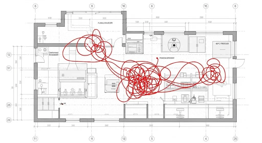
A spaghetti diagram overlays actual human movement onto a floor plan, visually exposing severe adjacency failures and excessive motion waste. | Credit: Gemini (2026)
What is a laboratory spaghetti diagram?
A spaghetti diagram is a simple line drawing that visualizes operational chaos, revealing the hidden inefficiencies in a floor plan. When architects design a laboratory, they often focus on maximizing linear bench space, sizing HVAC ducts, or ensuring strict building code compliance. However, once the facility is operational, the daily physical movement of the scientists—the lab circulation analysis—rarely matches the idealized CAD drawings. If a researcher has to cross a main transit corridor twenty times a day just to transfer samples from a biological safety cabinet to a -80°C freezer, the facility's design is inherently broken.
This is where Lean lab design interventions become critical. To objectively measure this inefficiency, facility planners utilize an observational tool called a lab spaghetti diagram. By physically tracking and tracing the continuous path of a technician during a specific assay, architects generate a tangled, chaotic web of lines that instantly visualizes "motion waste." This simple diagnostic technique highlights exactly where the physical layout is actively hindering scientific output.
Translating this data into architectural action requires rigorous adjacency planning. By analyzing the densest nodes of the spaghetti diagram, design teams can reconfigure modular casework, relocate shared core equipment, and establish logical work cells. This data-driven approach drastically reduces the physical burden on the scientific staff, ultimately accelerating throughput velocity and reducing cross-contamination risks across the laboratory floorplate.
Key Takeaways
Motion Waste: Identifying and eliminating the non-value-added transit time scientists spend walking between poorly placed instruments and storage zones.
Lab Circulation Analysis: Utilizing physical observation and continuous line mapping to evaluate the true operational flow versus the theoretical architectural design.
Adjacency Planning: Strategically grouping interdependent equipment (e.g., fume hoods, balances, and waste disposal) into tightly integrated, cellular workstations.
Modular Intervention: Leveraging flexible casework and overhead utility carriers to rapidly reconfigure layouts based on empirical traffic data without requiring hard MEP renovations.
How a lab spaghetti diagram exposes motion waste
In lean manufacturing, motion waste refers to any physical movement by an operator that does not add value to the final product. In a laboratory setting, this translates to the thousands of unnecessary steps scientists take daily to gather reagents, locate shared pipettes, or shuttle microplates to distant incubators. A lab spaghetti diagram is the primary diagnostic tool used to capture this invisible drain on scientific productivity.
To execute a lab circulation analysis, an observer shadows a technician performing a standard protocol. Every step is drawn as a continuous line on a scaled floor plan. The resulting graphic typically resembles a tangled bowl of spaghetti. To extract actionable architectural data from this chaos, planners must categorize the observed movements into specific spatial inefficiencies:
Transit to Shared Equipment: Excessive travel to centralized autoclaves, ice machines, or ultra-low temperature freezers that were placed in distant corridors to save prime lab real estate.
Material Gathering: Repeated trips to central supply closets because point-of-use storage at the active workbench is inadequate, poorly organized, or absent.
Cross-Traffic Interference: Movement paths that force technicians carrying sensitive, sterile, or hazardous samples to navigate through high-traffic administrative or main transit zones.
Ergonomic Strain: Suboptimal placement of heavy equipment requiring repetitive twisting, reaching, or lifting during the technician's transit path.
Why adjacency planning is the cure for a chaotic floor plan
Once the spaghetti diagram reveals the nodes of highest traffic and greatest inefficiency, the architectural solution is rigorous adjacency planning. This discipline abandons the traditional design approach of grouping equipment by type (e.g., placing all centrifuges in one dedicated instrument room) and instead groups equipment by process. If an RNA extraction protocol requires a fume hood, a vortexer, a microcentrifuge, and a hazardous waste bin, those physical elements must be co-located within a single, continuous work cell.
Effective adjacency planning physically shrinks the operational footprint of an assay. When executing this strategy, laboratory architects must prioritize several spatial relationships to compress the spaghetti diagram into a tight, highly efficient loop:
Primary Work Zones: Core instruments (e.g., biosafety cabinets, automated liquid handlers) must form the nucleus of the cell, with no more than a 180-degree pivot required to access primary consumables.
Secondary Support Zones: Refrigerators, incubators, and analytical balances should be located within a 3- to 5-foot radius of the primary zone to eliminate walking entirely.
Airlocks and Gowning: For cleanrooms or BSL-3 environments, gowning and de-gowning sequences must be strictly linear to prevent backtracking and cross-contamination.
Utility Proximity: Ensure that process-grouped equipment has immediate, localized access to chilled water, compressed air, and dedicated high-amperage electrical circuits to prevent power tripping.
Comparing Lab Traffic: Traditional Layouts vs. Adjacency-Planned Cells
Equipment Placement: Traditional layouts centralize equipment by function (e.g., "the freezer farm"), causing facility-wide transit. Adjacency-planned cells decentralize equipment by process, keeping necessary tools at the point of use.
Spaghetti Diagram Profile: Traditional layouts yield chaotic, facility-spanning webs with heavy overlapping in main corridors. Adjacency planning yields tight, localized, circular loops constrained to specific bench areas.
Contamination Risk: Traditional setups require transporting open samples across long distances and public zones. Cellular layouts contain sample handling within a dedicated, easily sanitized macro-environment.
Throughput Velocity: Traditional designs introduce high "waiting waste" as technicians queue for shared, distant resources. Optimized layouts drastically reduce cycle times by eliminating travel and queuing.
Expert FAQ: Lab Spaghetti Diagrams
Q: How long should you observe a process when creating a spaghetti diagram?
A: A single observation is rarely sufficient. To account for human variability and different assays, facility planners should map multiple technicians performing various standard operating protocols over several days to identify the most persistent layout failures.
Q: Can spaghetti diagrams be generated using digital tracking tools?
A: Yes. While manual pen-and-paper tracking is common and highly effective, modern facilities increasingly use RFID tags, Bluetooth low-energy (BLE) beacons, or overhead camera analytics to automatically generate continuous, highly accurate heat maps and digital spaghetti diagrams.
Q: What is the most common architectural fix after a lab circulation analysis?
A: The most frequent and cost-effective intervention is transitioning from fixed, floor-mounted casework to modular, mobile benches. This allows facility managers to physically slide workstations and point-of-use storage closer to hard-plumbed infrastructure (like fume hoods or sinks) without requiring expensive MEP renovations.
References
Womack, J. P., & Jones, D. T. Lean Thinking: Banish Waste and Create Wealth in Your Corporation. Free Press, 2003.
Yerian, L. M., et al. "A Collaborative Approach to Lean Laboratory Workstation Design Reduces Wasted Technologist Travel." American Journal of Clinical Pathology, vol. 138, no. 2, 2012, pp. 273-280.
National Institutes of Health (NIH). Design Requirements Manual (DRM). Office of Research Facilities, 2020.
Clinical and Laboratory Standards Institute (CLSI). QMS04: Laboratory Design; Approved Guideline. 3rd ed., CLSI, 2016.